From Spatial Clusters to Sustainability Strategies
Building reproducible spatial clustering workflows with the SKATER node in KNIME
Why municipalities need neighbourhood typologies
Making residential areas more energy-efficient is one of the biggest challenges facing municipalities today. Reducing energy consumption not only contributes to climate goals but also lowers energy costs for residents and improves the sustainability of our living environment.
The challenge is that there is no one-size-fits-all solution. Every neighbourhood has its own character. Some consist mainly of older owner-occupied houses that could benefit from insulation or heat pumps. Others are dominated by apartments connected to district heating, where completely different measures may be more effective. The key question for municipalities is therefore:
Which sustainability strategy is most appropriate for which neighbourhood?
Fortunately, municipalities have access to a wealth of neighbourhood-level data. Information about housing characteristics, demographics, socio-economic conditions and urban structure is publicly available. Rather than analysing every neighbourhood individually, it is often more useful to identify types of neighbourhoods that share similar characteristics. If neighbourhoods are comparable, they are also likely to benefit from similar sustainability strategies.
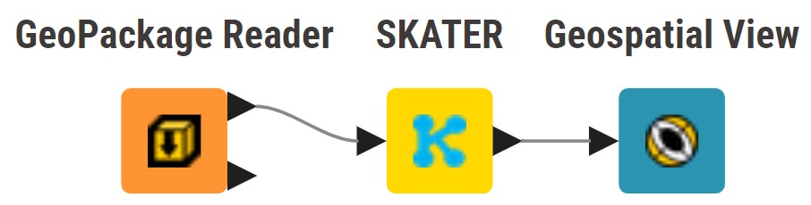
In this article, I demonstrate how the SKATER algorithm, available in the KNIME Geospatial Analytics Extension, can be used to identify spatially coherent neighbourhood types. By combining spatial clustering with neighbourhood characteristics and subsequently analysing their energy consumption. The story moves from data to practical insights that support neighbourhood-specific sustainability policies.
A note before we begin
Before diving into the analysis, I’d like to make one thing clear. I am not a GIS specialist. My background is in data science, and I have been working with KNIME for many years. This article is therefore not intended to demonstrate the “perfect” spatial analysis or to recommend sustainability policies for a municipality.
The case presented in this article uses real, publicly available data from Statistics Netherlands (CBS). While the analysis is based on real data and realistic assumptions, the selected variables, the interpretation of the clusters and the suggested sustainability strategies should be seen as illustrative examples rather than definitive conclusions. Municipal policy decisions require much more detailed analyses and local domain expertise.
The goal of this article is different. I want to show how the KNIME Geospatial Analytics Extension makes it possible to build a transparent, reproducible and easy-to-understand spatial clustering workflow. My hope is that this example inspires others to explore how geospatial analytics can be combined with data science to gain new insights from publicly available data.
If this article encourages you to experiment with spatial clustering in KNIME, or perhaps even inspires you to improve upon my approach, then it has achieved its purpose.
Start with the business question
When I first started experimenting with the SKATER node, my goal was simply to understand how the algorithm worked. I used the “Wijken en Buurten Kerncijfers” dataset published by Statistics Netherlands (CBS) and thought it would be interesting to cluster the neighbourhoods of the municipality of Leiden.
Getting the node up and running turned out to be remarkably straightforward. After selecting a number of variables and configuring the node, SKATER quickly produced an attractive map showing geographically coherent clusters.
However, I soon discovered that obtaining a map is the easy part. The real challenge is creating clusters that are meaningful and provide useful insights. The results changed considerably whenever I added or removed a variable. That made me realize I was approaching the problem from the wrong direction. For a meaningful clustering analysis, the starting point is not the available data or the clustering algorithm itself, it is the business question.
For this use case, I eventually formulated the following question:
Can we identify neighbourhood types that may require different sustainability strategies?
Identify the relevant factors
Once the business question became clear, the rest of the workflow almost followed naturally. Instead of randomly selecting variables, I first identified the factors that are likely to influence a neighbourhood’s sustainability profile.
For this study, I selected four factors:
- Housing stock
- Household characteristics
- Socio-economic status
- Urban environment
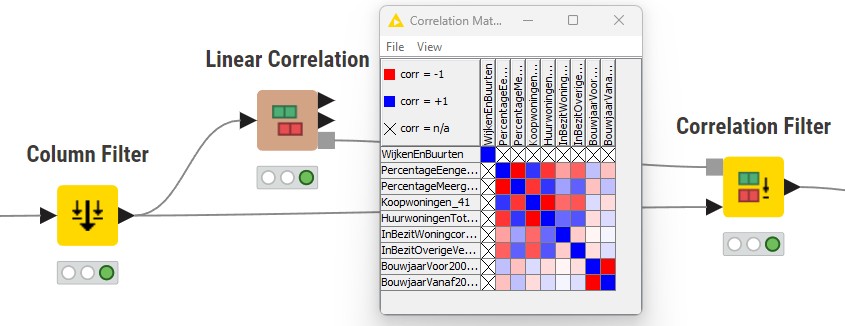
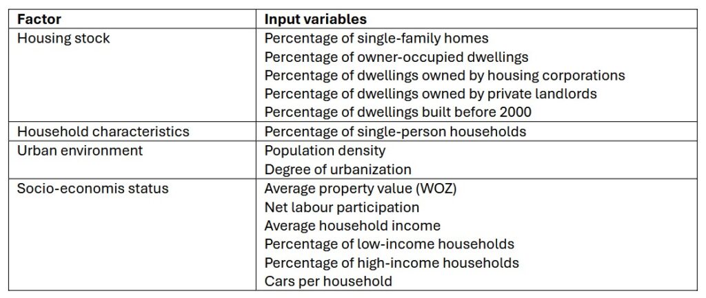
Together, these factors provide a balanced representation of a neighbourhood. Each factor can be represented by one or more variables. However, selecting variables requires some care. Including several highly correlated variables would unintentionally give that particular characteristic more influence on the clustering results. To avoid this, I examined the correlations with the KNIME Linear Correlation node. Together with the Correlation Filter node I ensured that each factor was represented without being overemphasized, see figure *
The following table shows the factors and the variables that were selected for the SKATER analysis.
Normalize the data
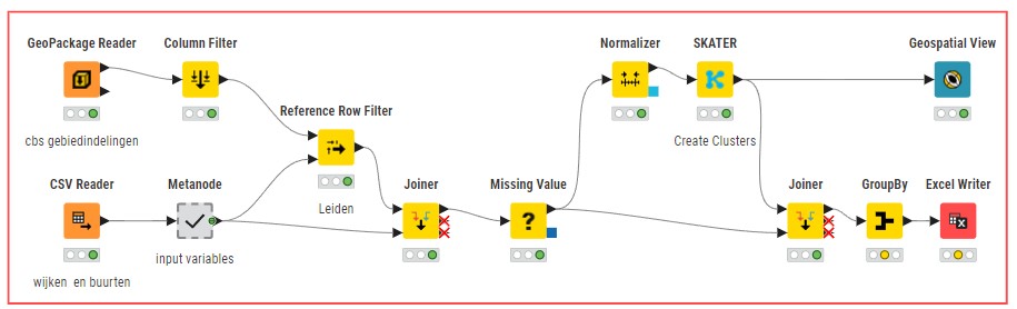
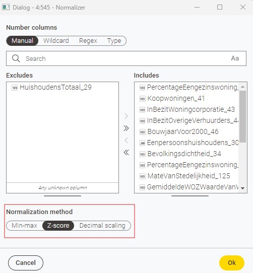
Because the variables use different units (percentages, euros, household counts), normalization is essential before calculating similarities between neighbourhoods. For this I used the KNIME Normalizer node.
Running SKATER
With the variables selected and normalized, the data is ready for clustering with the SKATER node. Before running the algorithm, it is important to ensure that the input dataset contains no missing values.
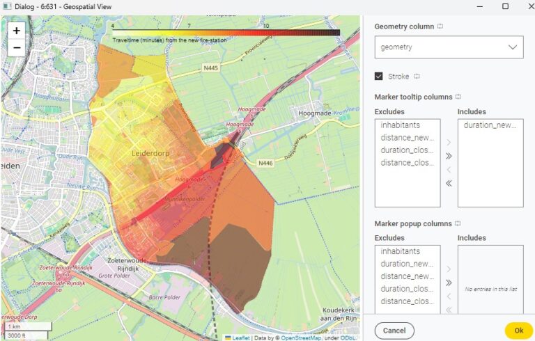
Configuring the SKATER node is surprisingly straightforward (see figure *).
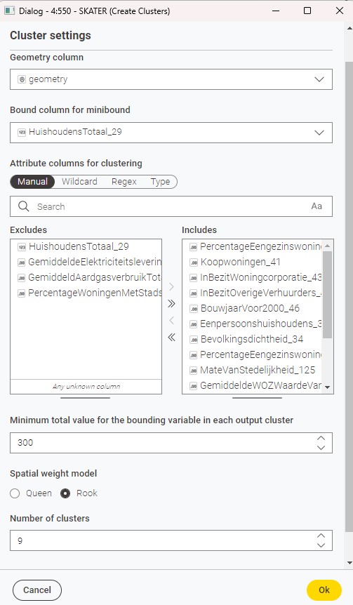
First, I selected Total number of households as the bounding variable and set the minimum bound to 300 households. This constraint ensures that every resulting cluster represents a sufficiently large neighbourhood and prevents the algorithm from creating very small clusters that would be less meaningful from a policy perspective.
For the Spatial Weight Model, I selected Rook contiguity. With this option, two neighbourhoods are considered neighbours only if they share a common border. The alternative, Queen contiguity, also treats neighbourhoods that touch only at a corner as neighbours.
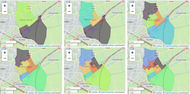
Finally, I specified nine clusters. Choosing the optimal number of clusters is not an exact science. It is often an iterative process in which statistical results are combined with domain knowledge. In my experience, experimenting with different numbers of clusters and evaluating whether the resulting neighbourhood types remain interpretable is more valuable than searching for a single “correct” number.
Thus the objective is not to maximize the number of clusters, but to find a balance between detail and interpretability.
Interpreting the clusters
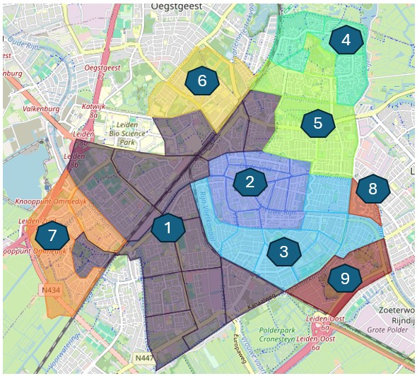
The output of the SKATER node assigns every neighbourhood to one of the nine clusters (see figure 5). To better understand the characteristics of each cluster, I calculated the average value of each input variable using a KNIME GroupBy node. These aggregated statistics make it possible to identify the distinguishing characteristics of each cluster and to assign meaningful names to the different neighbourhood types. Naming clusters is, to some extent, an interpretative exercise. The names presented below were developed with the assistance of AI and are intended to summarize the dominant characteristics of each cluster rather than provide definitive classifications.
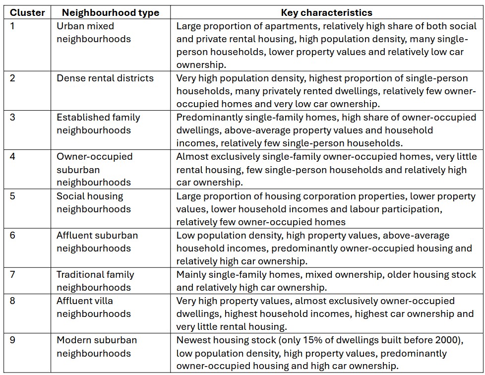
Although these cluster names are subjective, they provide a convenient way to discuss the results. More importantly, they reveal that the SKATER algorithm has identified neighbourhoods with clearly distinct demographic, socio-economic and housing characteristics.
Adding energy consumption
The next question is whether these neighbourhood types also differ in their energy consumption. A variable that was deliberately not included in the clustering itself. After the clusters had been identified, I added the average electricity consumption, natural gas consumption and the percentage of houses connected to district heating for each cluster by Statistics Netherlands (CBS).
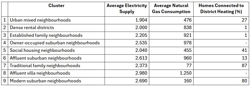
The results clearly show that the identified neighbourhood types exhibit distinct energy profiles. Some neighbourhood types consume considerably more electricity and natural gas than others, while the gas consumption of several clusters is strongly influenced by the presence of district heating. This demonstrates that neighbourhoods with different physical and socio-economic characteristics also tend to differ in their energy consumption patterns.
Although this does not imply a causal relationship, it does suggest that different neighbourhood types may require different sustainability strategies.
From insights to action
The objective of clustering is not to classify neighbourhoods, it is to support better decisions. Once neighbourhood types have been identified, different sustainability strategies can be explored for each of them. The table (see x) illustrates how the identified neighbourhood types can be translated into different sustainability strategies. The proposed strategies are illustrative rather than prescriptive, but they demonstrate how clustering results can be translated into neighbourhood-specific actions.
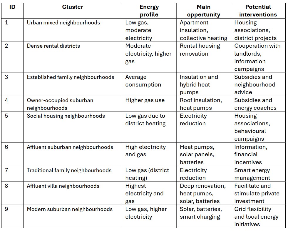
As an example, let’s take Cluster 8, Affluent villa neighbourhoods. This appears to be the most energy-intensive neighbourhood type. A likely explanation is that these neighbourhoods consist primarily of large detached houses with relatively large floor areas. At the same time, homeowners are likely to have the financial resources to invest in energy-saving measures. These neighbourhoods may therefore offer some of the greatest opportunities for reducing energy consumption on a per-home basis.
Naturally, this interpretation should not be seen as a policy recommendation. It merely illustrates how spatial clustering can help identify neighbourhoods with similar characteristics and explore which types of interventions may be most appropriate. Additional local knowledge and more detailed analyses would always be required before making policy decisions.
SKATER does not tell us what to do. Instead, it helps us understand which neighbourhoods are similar, enabling policymakers to develop targeted strategies rather than applying a one-size-fits-all approach.
Final thoughts
When I started this project, my goal was simply to learn how the KNIME SKATER node worked. Along the way, I discovered that configuring the node was actually the easiest part. The real challenge was designing a meaningful clustering analysis.
This case showed me that good spatial clustering starts with a business question, not with a dataset. Once that question is clear, the rest of the process, selecting factors, choosing variables, interpreting the clusters and translating the results into actionable insights, becomes much more natural.
That is exactly what I appreciate about KNIME. It provides much more than a collection of around 6,000 nodes (including geospatial algorithms). It offers a transparent and reproducible environment in which the complete analytical process can be captured in a single workflow.
I hope this example inspires you to experiment with the KNIME and the Geospatial Extension. But more importantly, to think about the questions you want your data to answer. If you do, the workflow and data used in this article are available on the my KNIME Hub as a starting point for your own analyses.